published at: 04.07.2025
Understandable Scientific Figures: Helena Jambor Publishes Checklist for Researchers
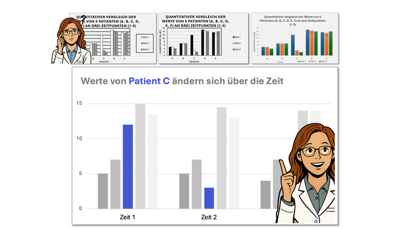
Dr. Helena Jambor, a molecular biologist at the University of Applied Sciences of the Grisons in Chur and the Faculty of Medicine at TU Dresden with the NCT/UCC Dresden, has now developed a practice-oriented checklist to help researchers design clear and effective scientific figures. The accompanying paper and the checklist were recently published in the journal Nature Cell Biology.
Every year, more than one million scientific articles are published in the life sciences. Two-thirds of them include statistical figures that are not always understandable, interpretable, or reproducible—even for fellow scientists.
"Just like a checklist helps pilots make sure they don’t forget anything before takeoff, this checklist can give scientists quick guidance on how to present their data," explains Dr. Helena Jambor. "For me, this publication sums up everything I’ve been teaching students for many years. They kept asking me for a simple guide—this is how the checklist came to be."
The article "Checklist for designing and improving the visualization of scientific data" offers a low-threshold, user-friendly guide for creating clear data visualizations. In addition to recommendations for selecting appropriate statistical charts, the checklist includes tips on text design, color selection, layout, and directing the viewer’s attention. "With this, I want to contribute to improving scientific communication," says Helena Jambor, describing her motivation.
For over ten years, Jambor has been working on the comprehensibility, reliability, and reproducibility of scientific figures—first at the Max Planck Institute of Molecular Cell Biology and Genetics, and later at the Faculty of Medicine at TU Dresden. At that time, there were no standardized guidelines or best practices for publishing and reproducing figures.
"Visual aids help us make decisions every day," says Helena Jambor, emphasizing the importance of a checklist for visualizations. "We navigate using road signs and communicate with emojis. Visual aids give patients a way to better understand their treatments, especially in difficult situations. Doctors can use them to integrate various data into their decision-making, and researchers can more easily grasp the impact of new treatments. Poor visual aids, on the other hand, are harmful. They lead to misinterpretation of treatment processes or biomedical research data."
In November 2024, Helena Jambor received the Early Career Einstein Award for her project "PixelQuality – Best practices for publishing images", together with Dr. Christopher Schmied from the Leibniz Institute for Molecular Pharmacology in Berlin. But Helena Jambor is not only dedicated to improving communication among scientists—she is also committed to enhancing communication between doctors and patients. In January, she published a study in the Journal of the American Medical Informatics Association on the use of visual aids to help patients understand treatment plans.
Publication:
Nature Cell Biology publication "Checklist for designing and improving the visualization of scientific data": https://www.nature.com/articles/s41556-025-01684-z
Contact:
Anne-Stephanie Vetter
Staff Unit Public Relations of Carl Gustav Carus Faculty of Medicine
at TUD Dresden University of Technology
National Center for Tumor Diseases (NCT/UCC) Dresden
Tel.: +49 (0) 351 458 17903
anne-stephanie.vetter@tu-dresden.de
www.tu-dresden.de/med


